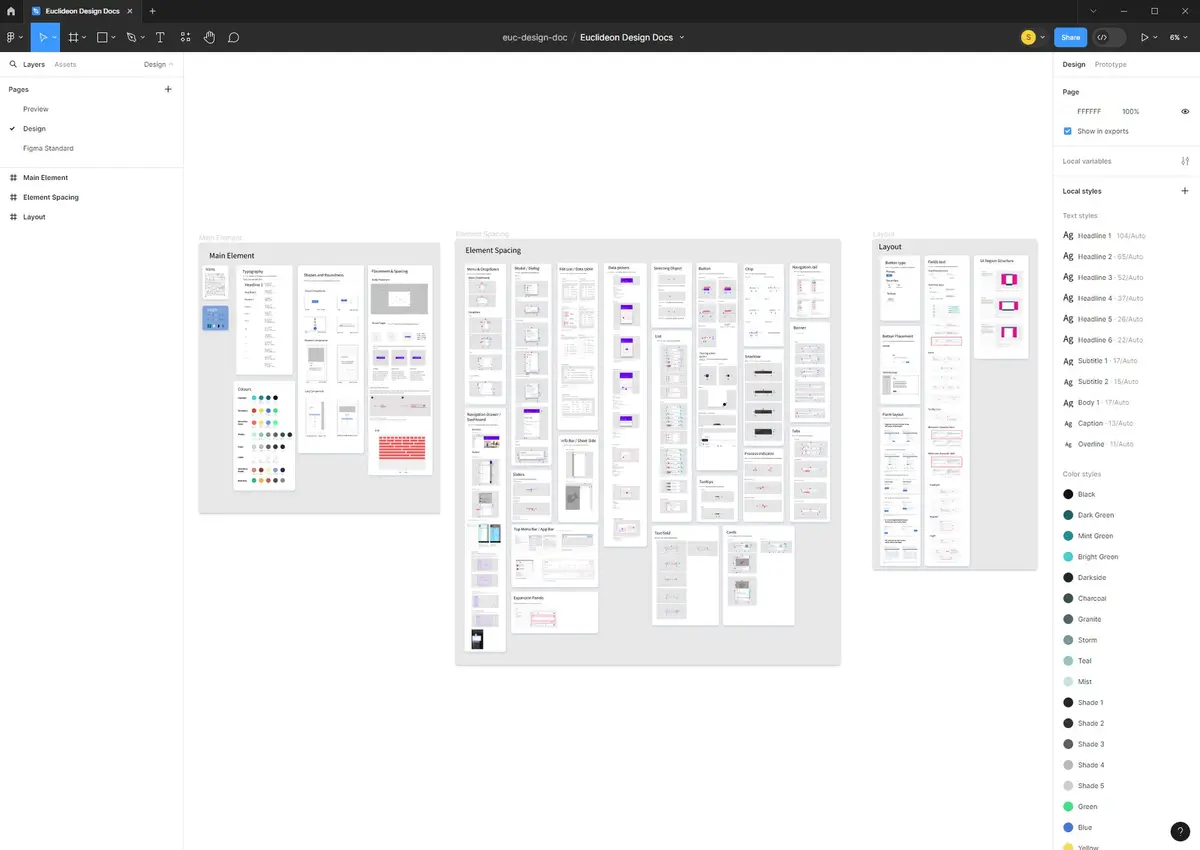
Design System
A comprehensive design system built on, and closely modelled after, Google's Material Design — adapted with custom typography, colour palette, and iconography to deliver a consistent, efficient user experience across Euclideon's digital products.
Overview
This UI Design System is closely modelled on Google's Material Design guidelines, serving as the foundation for consistency across Euclideon's product suite. It reflects a commitment to a cohesive user experience — built efficiently by adapting an established, proven design language rather than starting from scratch — emphasising clarity, usability, and aesthetic appeal.
Core Elements
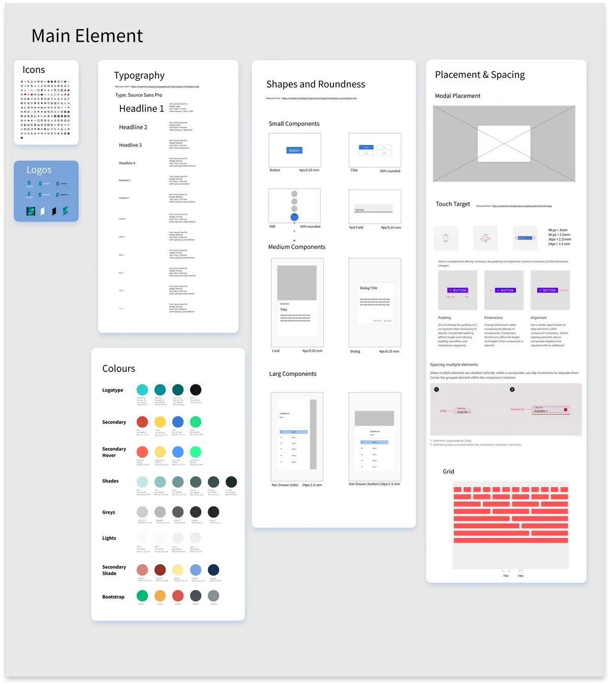
Colour Palette
A custom colour scheme adapted from Material Design's colour principles, supporting accessibility and consistent user engagement.
Typography
A typeface selection aligned with Material Design's typographic scale, adapted for readability across devices.
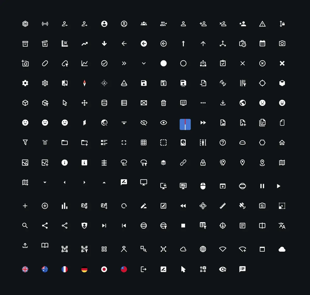
Iconography
Custom icons developed in the visual language of Material Design, ensuring intuitive interaction cues across all applications.
Design Standards
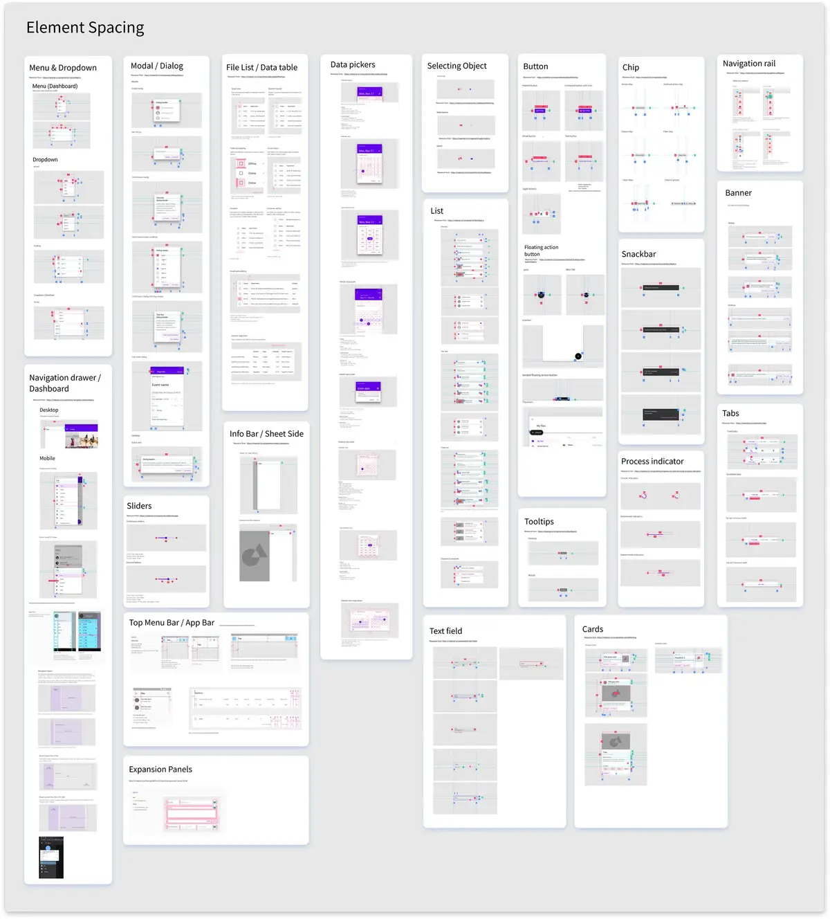
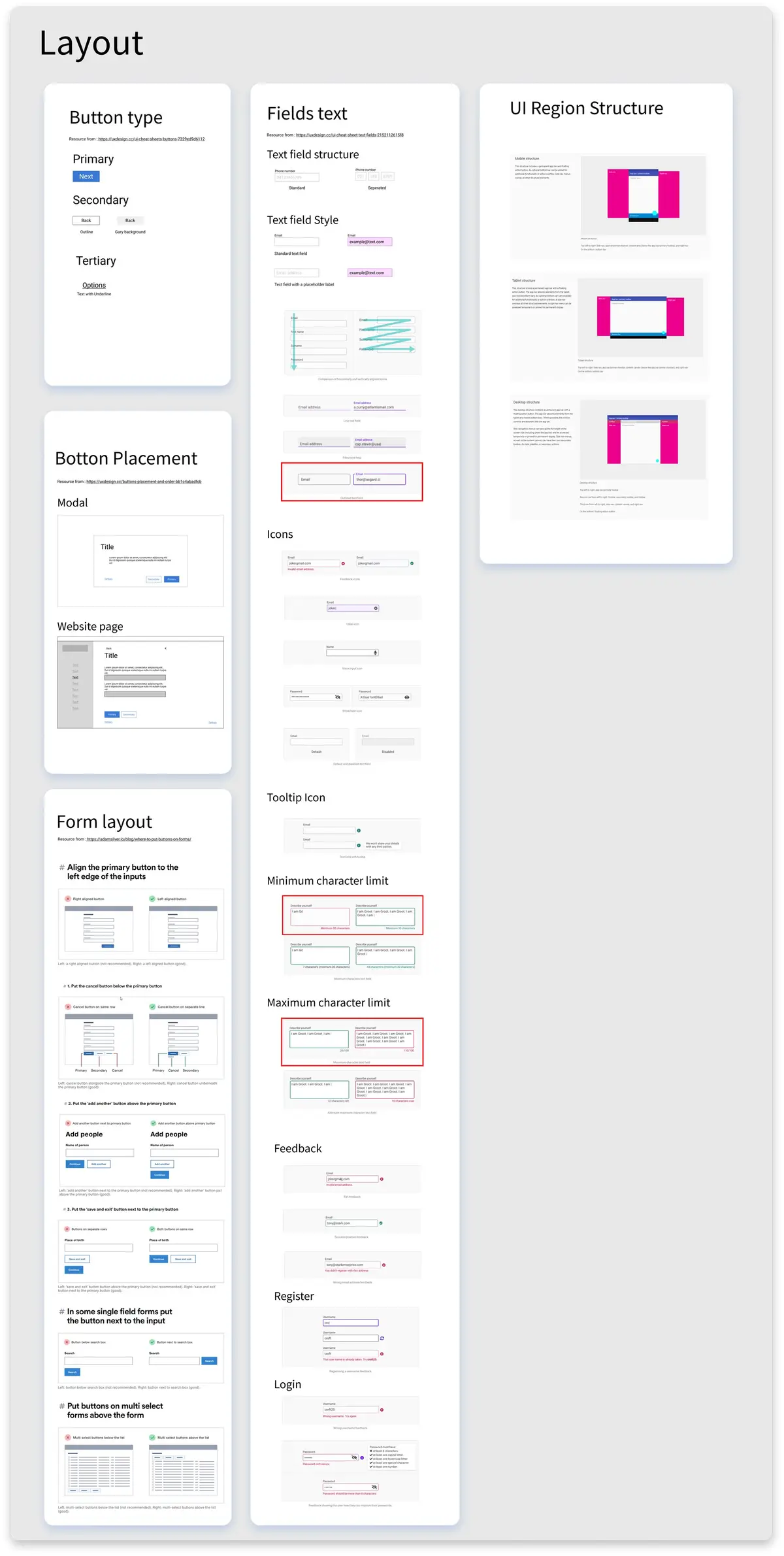
Element Spacing & Layout
Spacing and layout guidelines adapted from Material Design's structure, creating a harmonious visual flow across every touchpoint in the product suite.
Implementation & Impact
Adapting an established design language allowed for a faster, more consistent rollout across the product suite than building from scratch. This streamlined the design process, enhanced collaboration between design and development teams, and significantly reduced design debt while accelerating product development.